
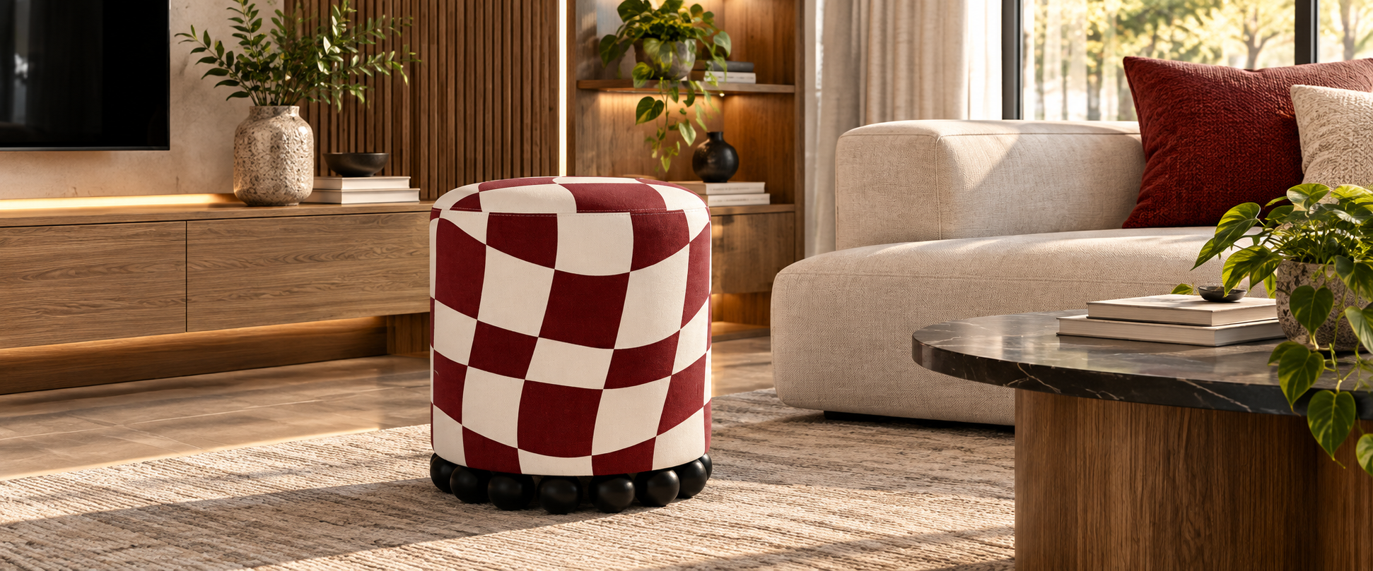
The light from a narrow vertical niche falls on the warm wood and stops near the floor. Long green leaves stretch nearby, glossy facades catch reflections, black lines of furniture maintain a calm geometry. The space has almost come to an agreement with itself: wood, milky surfaces, glass, light, greenery. Everything is in its place.
And suddenly, in this correct system, a small cylinder appears.
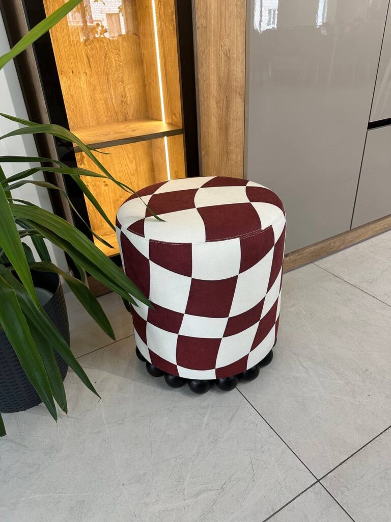
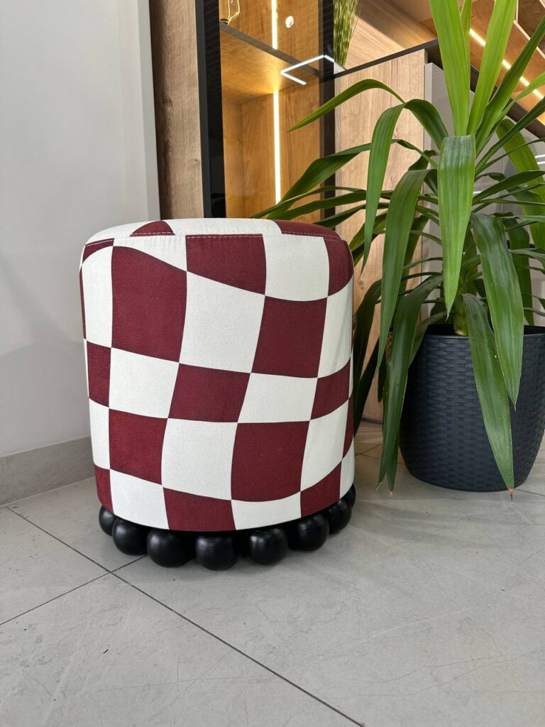
At first it seems just burgundy and milky. Then the gaze lingers. The squares on it are not quite squares. The lines seem to move. The chessboard stretches, bends, floats on the rounded surface. Even lower is a row of black wooden balls, as if someone had added a necklace, small wheels, or a strange rhythmic signature to the piece of furniture.
You can walk past.
And you can go back and watch it again.
It is from this moment that RITMO in the Mastermind print begins to work not as “another pouf”, but as an accent. It does not need a large area. It does not need complex decor around it. It does not need an entire room filled with prints. Its strength lies precisely in the fact that it is small – and therefore can afford to be bolder.
At Instagram, we put it simply: a small pouf with big plans for your interior. The burgundy and milky chessboard seems to float on a rounded shape, black wooden balls add playfulness, and a small optical illusion makes the familiar object look from all sides. In RITMO Mastermind posts on Instagram This idea works as a short visual impulse. Here we will analyze it in more depth: why small furniture often gives more freedom to design than large ones; how print interacts with volume; why an ottoman can be not a secondary object, but a compositional point; and what to consider if you are planning to buy an ottoman not “to put”, but for a specific interior.
RITMO is exactly the model that clearly demonstrates the KAIZEN philosophy: a simple base, a well-thought-out shape, a comfortable function and the ability to change character through fabric. In plain color, it is a calm, compact item. In Mastermind, it is a small graphic provocation.
One form.
And a completely different mood.
The chessboard is one of the most recognizable geometric motifs. It is disciplined, rhythmic, predictable. White gives way to dark, dark to white. Vertical meets horizontal at right angles. The eye quickly understands the rule and stops looking for a riddle.
Mastermind does the opposite.
Here the rule seems familiar, but the surface does not allow it to remain stable. The burgundy and milk blocks bend, expand, narrow. The horizontal lines lower and rise. The vertical ones deviate slightly. The cell seems to refuse to be drawn on a plane and begins to behave like a fabric even before it ends up on the furniture.
And then it is pulled onto the rounded RITMO.
And the effect is intensifying.
On the frontal plane we see one geometry. On the side, another. From above, the squares change proportions once again through perspective and the radius of the seat. If you walk around the pouf, it seems as if the print moves a little with you.
It is this effect that makes Mastermind much more interesting than just a “maroon cell”.
Mastermind Formula:
FAMILIAR PATTERN + DEFORMATION + ROUND VOLUME = VISUAL MOVEMENT
And there’s an important design logic here. A strong print doesn’t necessarily have to contain lots of colors, complex illustrations, or dozens of small details. Sometimes it’s enough to take a very simple rule—the checkerboard—and change one parameter: geometric stability.
The color also works perfectly. Burgundy is deeper and calmer than bright red. It doesn’t make the pouf look childish or too sporty. Milky, in turn, is softer than pure cool white. Because of this, the contrast remains strong, but not harsh.
In a space with warm wood, these two colors sound natural. Burgundy gives depth, milky supports light surfaces. Black details in the interior are continued in the dark base of the pouf.
Therefore, the accent does not seem accidental.
He is bright — but collected.
This is how we understand print in furniture: not as a decorative layer added after the shape is complete, but as an element that works together with the volume.
There is a common perception that the main interior items are always large pieces of furniture. A sofa defines the living room. A bed defines the bedroom. A large table defines the dining room. A wardrobe defines storage.
Functionally, this is indeed the case.
Compositionally, not always.
Sometimes a large sofa is intentionally made as neutral as possible. It takes up a lot of space, so too much active fabric can quickly overload the space. The same goes for curtains, large rugs or massive cabinets. The larger the surface, the more its color and pattern affect the room.
Small furniture gives a different freedom.
The pouf can be made bolder.
The banquette can be allowed a more active color.
The chair can get an art print, even if the sofa remains plain.
That’s why RITMO Mastermind doesn’t need to be “supported” by five more items with the same cell. On the contrary, it is best read next to a calm base.
In the specific interior, this is very noticeable. Wooden panels create a warm background. Light glossy facades are large and neutral. The floor is light. The plant introduces organic greenery. The black lines of the frame and details collect the composition.
And in the midst of all this, the burgundy and milky RITMO works as a punctuation mark.
Small, but visible.
Error: to think that the accent should be big.
Decision: use a small object with a strong character.
Error: duplicate the print throughout the room.
Decision: leave RITMO as the only active graphic point.
Error: choose a pouf that matches the color of the sofa.
Decision: Look not for coincidence, but for the interaction between shades.
Error: to place an active print among many other active patterns.
Decision: give Mastermind a visual air.
Error: consider the pouf only as an additional seat.
Decision: use it also as a compositional tool.
This is the advantage of a small accent: it doesn’t take up space physically, but it can seriously change the space visually.
TO: neutral zone, the right materials, but no object to focus on.
AFTER: RITMO Mastermind appears. Burgundy introduces color, checkered pattern – movement, black base – graphic rhythm. The interior does not become colorful. It simply gains character.
That is why the question “where to put the pouf?” should often be replaced with another:
“Where does the interior need an accent?”
RITMO has a very simple basic silhouette: a compact vertical volume with rounded edges and a soft top.
And it is this simplicity that gives the print space.
If the shape were complex, with a lot of structural details, creases or individual cushions, Mastermind would have to constantly compete with them. Here, things are different. The large continuous surface allows the pattern to unfold around the object.
It is especially interesting that he works from above.
The chessboard moves from the vertical part to the plane of the seat. The lines that seemed almost vertical from the side suddenly start to run in a circle. The rounding of the upper edge gives the impression that the fabric is actually floating.
In this case, print deformation and perspective deformation work together.
And below, a second rhythm appears – wooden balls.
This is an important detail of RITMO. If the pouf had a regular cylindrical base or four inconspicuous legs, the object would look much more restrained. The row of balls adds a bit of play and picks up the roundness of the body itself.
The dark legs of Mastermind work particularly well. The black color cuts off the burgundy and milky graphics from the floor and creates a distinct lower contour.
Here a second type of rhythm arises:
PRINT → square and wavy
SHAPE → round
BOTTOM DETAILS → round and repeating
That is, the geometry is intentionally not made monotonous.
This is what gives the subject a sense of design play.
At the same time, the technical base remains serious. The frame is made of furniture plywood, and the legs are made of solid beech. That is, the decorative idea does not replace the design.
This is fundamental to KAIZEN.
You can make a strange print.
You can add unusual legs.
You can play with color.
But the object should still remain furniture: stable, functional, and designed for real use.
“Kaizen means improvement.” — Masaaki Imai
For us, this describes the very principle of working with a model well. It is not necessary to invent a new form every time. Sometimes a stronger result is born when an already thought-out basis is improved through material, graphics, color and details.
RITMO is exactly that.
The form remains.
Character can be changed.
When a person plans to buy an ottoman, the first explanation is almost always functional: extra seating.
That’s right.
But it’s not enough.
In a modern interior, an ottoman can perform several roles at once, and it is this multifunctionality that makes it a strong small object.
The most obvious scenario.
In the living room, guests arrive – RITMO easily slides into a group of upholstered furniture. In the dressing room or hallway, it becomes a place to sit. In the bedroom – it works next to a dressing table or wardrobe.
The small format is an advantage here: the object is easy to rearrange.
Next to a large neutral sofa, Mastermind can work almost like a decorative pillow, only in three dimensions.
It adds a print, but doesn’t force you to make the entire large surface of the sofa printed.
In a corner next to a console, plant, floor lamp or art, RITMO doesn’t need a large furniture group.
He can exist alone.
Such small compositions often make the interior complete.
Here, design often loses out to function. You need a closet, a mirror, a place for shoes, and the space quickly becomes purely utilitarian.
One statement pouf can make all the difference.
In a dressing room, RITMO can be both functional and decorative. And a bold print often works even easier there than in a large living room, because the room has a clear personal function.
Showroom, salon, boutique, reception, studio, store – it is in such places that small designer furniture can create a great visual effect with minimal occupied space.
| Scenario | What does RITMO do? | Why Mastermind works |
|---|---|---|
| Living room | Additional seat and accent | Contrasts with a neutral sofa |
| Hallway | Functional fit | Creates an immediate first impression |
| Wardrobe | Mobile seat | Adds personal character |
| Bedroom | Pouf near the dressing table | Enters print without overloading |
| Showroom | Visual point | Well remembered |
| Salon / studio | Function + decorativeness | Works as part of identity |
Therefore, the question “should I buy an ottoman or will it be unnecessary?” should be considered through a scenario.
If the room already has everything you need, but it seems too predictable, RITMO can be just the little change that is missing.
Mastermind is important not only as a specific drawing.
It well demonstrates the broader KAIZEN principle: furniture fabric can be a full-fledged carrier of design.
Instead of perceiving upholstery as the last stage — “now let’s choose a color” — you can start the entire concept of the object with it.
It is this logic that we reveal in more detail in the material about furniture with individual design and art print: graphics, the scale of the pattern, its location, the texture of the fabric, and the shape of the furniture can be designed as one system.
RITMO Mastermind is an example with a ready-made art print.
But the principle itself can be developed further.
The chessboard can be a different color.
The scale may change.
You can move from geometry to floristry, abstraction, or author’s graphics.
You can create an item for a specific project, where the print repeats the shades of a painting, curtain textiles, or elements of brand identity.
The difference between regular upholstery and art print is not only the presence of a pattern.
The difference is that how exactly the pattern interacts with the furniture.
Mastermind works well on RITMO because its large blocks don’t get lost in a small area. The deformation of the pattern maintains a rounded shape. The contrast is strong enough to make the subject readable from a distance.
For another model, the rules may be different.
For example, a floral print requires precise placement of large elements so that the flower does not accidentally “cut off” by a structural seam or the edge of the seat. This is clearly seen in the story OASIS with Wild Garden print, where large burgundy flowers, black leaves, and symbolic elements are adapted to a completely different geometry.
That is, the print does not exist separately from the form.
What works well on a compact ottoman needs to be arranged differently on a chair.
On the couch, it’s even different.
On the large headboard – again differently.
This is where furniture design begins, not just printing on fabric.
RITMO is available in 10 art prints and solid colors, so the main question before ordering is not “which one is more beautiful?”.
There can be several beautiful ones.
You need to understand which one will work. in your space.
First, evaluate the base, not the decor:
They form the background on which RITMO will live.
If the base is calm, Mastermind can work boldly.
If the room already has a lot of active prints, it may be better to choose a different option or a solid color.
A pouf doesn’t necessarily have to repeat another object.
Enough communication.
Burgundy can resonate with a painting, a small vase, book spines, a decorative pillow, or even the warm shades of wood.
The black base can support frames, lighting, table legs, or appliances.
Milk – walls, carpet, sofa or facades.
In a small room, RITMO can become the main accent.
In the big one, work as part of a furniture group.
Both are correct.
The mistake begins when a small object is expected to “fill” a huge space by itself without any compositional connection.
Will you sit on it every day?
Rearrange?
Use in a dressing room?
Keep it by the sofa?
Put it in the hallway?
This affects the fabric, the color, and the level of practicality.
This is where the choice becomes much more precise.
Instead of imagining RITMO in a vacuum, you can appreciate the actual floor, lighting, furniture, wall color, and scale.
That’s why at KAIZEN we offer not only choosing a print, but also choosing the color and fabric for your space.
On the page RITMO pouf you can take a closer look at the model itself and the execution options. And if you already have a photo of the place where you plan to put the pouf, it is much more useful than the abstract “I have a roughly beige interior”: a real shot immediately shows the color temperature, materials, and neighboring objects.
The cost of the model is 6,980–10,025 ₴, depending on the implementation.
The frame is made of furniture plywood, the legs are made of solid beech. 10 art prints and plain solutions are available.
That is, the final RITMO can be adjusted to different levels of boldness: from a calm monophonic version to Mastermind, which takes on the role of an accent.
There are two ways to assemble the interior.
The first is in sets.
The sofa and armchair are the same. The pouf is made of the same fabric. Everything is as coordinated as possible.
The second is through dialogue.
The shapes may be different, but they are united by a palette. One object is neutral, another is an accent. The wood is repeated in the details. Black runs in a thin line through several objects. One print gives rhythm, and everything else creates a pause.
KAIZEN is a closer second approach.
For example, a large, solid-colored sofa and RITMO Mastermind can work harder than a sofa and ottoman completely upholstered in the same fabric.
The pouf then doesn’t get lost.
He responds to the big subject with his own intonation.
The same can be done with the chair. OASIS can remain a calm monotone or take on a completely different print, as long as there is enough visual air between the items. In the article about OASIS armchair for the living room We separately analyze how the same shape changes character through fabric and how an accent chair works in the composition of a space.
It is not necessary to buy furniture “in a series” to make it look connected.
Sometimes a connection is built through:
The latter scenario is particularly well suited for RITMO.
LARGE NEUTRAL VOLUME + SMALL ACCENT ITEM = BALANCE
For example:
milk sofa + RITMO Mastermind;
dark brown sofa + RITMO Mastermind;
light wood + RITMO Mastermind;
calm gray-beige room + RITMO Mastermind.
The print injects energy, but the area of the object is small enough not to overload the overall picture.
This is its great advantage.
Let’s go back to where it all began.
To a warm wooden niche.
To the long green leaves.
To bright facades.
To a small cylinder that seems to just stand in the corner.
Now it doesn’t seem so simple anymore.
We see how the print bends along the radius.
How burgundy interacts with wood.
As milk supports a light base.
How black balls separate the body from the floor.
How the small area of the item allows you to use graphics that might be too active on a large sofa.
And it is here that it becomes clear why the phrase “a small pouf with big plans for your interior” works so accurately.
RITMO does not claim to be the largest item.
He doesn’t need it.
His task is different – to make the few square meters around him more interesting.
Add rhythm.
Give a colored point.
To disrupt a composition that is too correct.
Create a small moment where the gaze stops.
That’s why buying an ottoman sometimes means more than just adding another seat. It can be the easiest way to change the tone of an already finished interior without a new renovation, without replacing the sofa, and without a lot of decor.
Mastermind does this particularly prominently.
One subject.
Two primary colors.
One familiar pattern that suddenly stopped being correct.
And this small change is enough.
If you want to see RITMO again in real space, go back to Instagram posts from Mastermind: there, a short story shows the main thing – a pouf does not need a room completely filled with prints to be noticeable.
And if there is already a place where you imagine it, the next step is even easier: send a photo of the space to Direct KAIZEN and write “RITMO”. Based on the real interior, you can more accurately choose the print, fabric, and color and calculate the cost of your specific design.
And, perhaps, this small item will be the detail after which the room will finally stop looking “almost finished.”